Showing posts with label color. Show all posts

Monday, April 16, 2012

Room of the Week - A Bright Idea

For the past few weeks I have been knee deep picking paint colors for clients, and am always drawn to rooms that take a risk.  This room really caught my eye, and I think I fell in love with its simplicity...tall ceilings with gorgeous molding, all white walls, and just a touch of well placed paint.


I am also huge fan of all white bedding (with the option to switch around the accent pillows), and the only change I would make would be to add a piece of art (or two!).  The molding above the bed makes an instant frame and gives the illusion of a headboard.  I too am considering a little painting of my own (in the bedroom), and am still searching for the perfect color mint...something that reminds me of a cool sorbet but is still warm and fresh. Like any of these?  Suggestions most welcome...

Happy Monday!
xSB


Thursday, April 12, 2012

Warmer Days Ahead

Recently, I took the time to go back through all of the pictures taken from my last trip to Portugal, Spain and Morocco, and this image is one of my very favorites.  It brings back fond memories of the run I took high above the beachcombers, along the southern coast of Portugal, with a view that simply took my breath away.  Post workout, I found myself poolside, book, sunscreen (and yummy frozen drink) in hand... 


What was in my beach bag you ask?  A simple suit (one-piece suits are my new favorite thing!), lacy shorts and of course a pair of oversized shades.  A fun top knot bun (and a pretty pedicure to boot) and I was set.  With temperatures heading back up into the 80's later this week (I can hardly wait!), and bathing suits lining the racks of department and speciality stores alike, I thought this might inspire a pop of color in your beach bag this season.

Only one more day 'til Friday!
xSB


Monday, April 9, 2012

Pantone Playdate - Pretty Pastels

One of my favorite things about this time of year is the opportunity to design with pretty pastels in mind (after all, wedding season is upon us!).  These two hues pair together perfectly...not to mention they look good enough to eat!

Images Clockwise: 1 2 3 4
Does this palette inspire you?  We hope it is a refreshing start to your week ahead!
xSB

Wednesday, March 28, 2012

Mint + Peach = Good Enough to Eat

The perfect pair, this delicious palette of cool mint (it reminds me of "Daiquiri Ice", my very favorite sorbet from Baskin Robins) and soft peach, have us eager for warmer weather, flowy fabrics, and perhaps a little ice cream too!


We created this storyboard for a spring wedding we are styling (the bridemaid's dresses are 
ever-so-lovely), and thought this might be the perfect, simple statement for this pretty party.

Dress  Shoes Clutch Belt Bangles Coral Polish Mint Polish

Do you agree?  These soft sorbet shades definitely have us swooning.  What's your favorite wedding palette for the season? 

Monday, March 19, 2012

Art in Bloom

The weekend was full of celebration and color for me.  My former design assistant was married on Saturday (peek here for a pretty pic), and on Sunday I slept in, played in the garden, caught up on a bit of reading (am in serious like with this VOGUE cover by the way), took a few long walks in the neighborhood (can you believe the cherry blossoms are already in bloom?), AND...


...thoughtfully hung this new painting on the wall in my bedroom. (Boom!)  It is sooo gorgeous and totally 
inspiring--the perfect way to start each and every day.  Tonight I am sure to be inspired once again, as I attend the NACE Baltimore Chapter UNCORKED! fundraising event.  I can't wait to put on a party dress, reconnect with industry colleagues, and see the dining room in creative bloom!

Until tomorrow,
stephanie

* Images 1 & 2

Wednesday, March 7, 2012

Mixology - Pattern & Print

For those that know me best, they know I love color, texture, art, and all things design. I love mixing different patterns and prints, and one of my strengths has always been putting unexpected combinations together in both interiors and events. I go crazy for textiles too, and there isn't a fabric store I can walk by without peeking in.  I find myself pushing my clients to take risks with texture and pattern, and the end result is often such a thrill.  I also mix patterns in my daily wardrobe and in my home (you should see the collection of ikat pillows on my neutral sectional!).


This week, I have a rather large art project in the works.  Yes, one that requires a large, sharp pair of scissors, an intricate grid system, and a few yards of gorgeous fabric from our friends at Versace and Chanel (found here).  I am using this delicious color palette for our custom piece(s), and can't wait to share the finished product with you next week!

Want to see a few other patterns and prints currently inspiring my designs...peek here!


Images here, here and here

Monday, February 20, 2012

Color Me Monday

It's hard to believe that we are halfway through the month of February.  I am already craving warmer weather and the opportunity to move those delicious brights back to the front of my closet.

Next week at this time I'll be in LA for a long awaited trip to spend a few exciting days here with designers and bloggers alike, and I can't wait to share all of that with you upon my return.

In the meantime, I have a solid week ahead of wrapping up design projects (while getting a few new ones qued up) and I couldn't be more excited about all the things happening at the studio.  This week I am going to get out my color wheel and spin the needle, begin packing my bags a day or two early (I hope), and remain inspired by the little things that make life so lovely. For some reason, the colors today just seem a bit brighter.

Make it a great week!
xo,
stephanie

Monday, February 13, 2012

PANTONE PlayDate - Knockout Pink


Lately I have been obsessing over brightly colored hues (of pink and mint especially seen here and here) and can't seem to get enough saturated color.  When one of my interns showed up at the studio last week with shocking pink nails (and Valentine's Day now less than 24 hours away), I thought it was the perfect time to feature "Knockout Pink" from Pantone's Nylon Brights collection.  I love how this fun shade pops against neutrals but also plays well with other brights too. There are many great ways to inject this bold color into your wardrobe, home, beauty routine or even your next event.  Here are a few ways our intern Katie suggests...

Are you brave enough to incorporate this color into your daily routine?  After all, tomorrow may be the perfect opportunity to start...

Happy Monday!
xo,
stephanie


*all images found via Pinterest

Wednesday, February 8, 2012

Get the Look - Outfit To Room

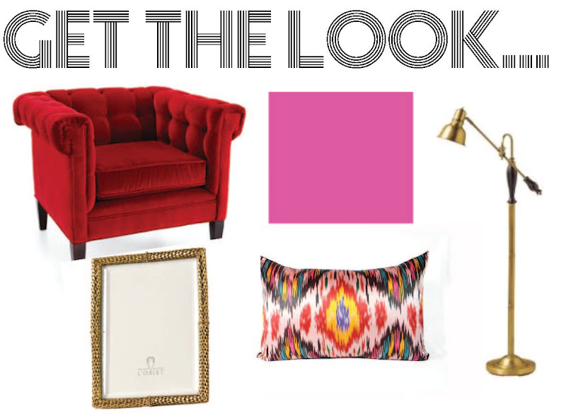
This week my team and I have been inspired by all things "Valentine" and this color combo of pink and red is so fun and flirty.  While a little tricky to pull off, when done right the results can be ah-mazing!  The adorable Julia of Gal Meets Glam hits the mark in her bold, bright pairing while keeping accessories black.

I love taking design risks and these hot pink walls are simply stunning--a risk well taken.  The black fireplace paired with the fire engine red couch and accessories with a twist in gold (and a little pattern on the pillows and the carpet, also love!) make this room one perfect for entertaining and stimulating conversation. 

Red Tufted Chaie Horchow  ||  Exuberant Pink Paint Sherwin Williams  ||  Kichler Lamp Amazon Robert Allen L'object Gold Plated Frame Siena Julia  ||  Vintage Ikat Pillow Etsy
Are you brave enough to try this color combo at home...or just the envelopes of your Valentine's?
xo,
stephanie

Friday, January 20, 2012

Inspiration - Purple Friday

Ironically, I am not usually one to talk at length about professional sports or football for that matter (I often have my nose buried in a design magazine while the game plays in the background), but it is indeed an important weekend for Baltimore as the Ravens travel to New England to play Tom Brady and the Patriot's.  I have to admit, I truly am getting excited for the BIG game ahead and that got me thinking about all things purple (aubergine and lavender too!), and inspired this post.  I hope it inspires you to add a little purple to your windows, walls or wedding!

Love it or leave it?  Personally I am fond of mixing it with oranges and pinks but combining it with the bright neon trend would be amazing too (I feel another tablescape brewing).  I will agree, it can be a challenging color to work with, but this weekend it will compliment anything YOU are wearing...

GO RAVENS!
xo,
stephanie

Images 1, Domino, 3, 4, 5, 6, 7-8, 9

Thursday, January 12, 2012

Baltimore BRIDE - Eye Candy & CAKE!

 
                            Images by Stacy Zarin
For the past several years, we have partnered with the creative team at Baltimore Bride magazine to create delicious tablescapes and this year was certainly no exception.  Our design challenge...to create a tabletop display good enough to eat and with the help of our partners at Charm City Cakes that was not a difficult task.  The inspiration for this design started here with this color palette--bright tangerine ("Tangerine Tango" being the Pantone Color of the Year!), teal and crisp white.  I wanted to work in the ombre trend (which I am still loving) especially in florals, and create a modern gallery feel. So many brides are requesting a fresh twist on traditional design, incorporating plenty of special details for a very personalized event start to finish.  2012 is all about bold colors mixed with softer hues and taking risks to make each celebration one to remember.

I enlisted the help of the team at Fleur de Lis Florist to create (what I refer to as) "my ombre dream."  To have seen these florals in person was breathtaking.  The paper details including the framed sign (above), place cards and menus were crafted by the talented Carla David Design.  
Want to look behind the scenes at pulling all this together?  Peek here.


This is the sketch of the cake BEFORE the making of the masterpiece and we couldn't have been more delighted with the finished design.  We added a little sequin trim to our cake stand and it was just the embellishment we needed to make this cake sing, sing, sing.


Many thanks to each of our talented vendor partners including: 
Charm City Cakes, Carla David Design, Fleur de Lis Florist, Table Toppers, Gore Dean, 
The House Downtown, Macy's, Pier 1 Imports, and the Tremont Plaza Hotel & Grand Historic Venue.

AND DON'T FORGET...to pick up a copy of Baltimore Bride on newsstands now AND mark your calendar for one of two bridal events coming up this winter...Click HERE for tickets and more info!  

All images by Stacy Zarin
Magazine story by Janelle Erlichman Diamond

Thursday, December 22, 2011

Feathered Fun in NYC!

On Monday of this week I treated my design team (minus one intern-we missed you Kelsey) to a quick trip to New York City for a day of inspiration, an amazing Italian lunch (here) and of course a little holiday shopping.  If you read my 2011 Holiday Gift Guide you may have noticed I had one of these beauties (#7) on my list and am still dying for an off white one to go in the dining room of my apartment. Upon my arrival in the city, I received a surprise phone call telling me that my new friend, Kim from Authentic Africa, would be in the area "in 20 minutes" and was willing to give me a peek at her current inventory.  I couldn't have been more delighted and literally ended up meeting her in Manhattan within minutes of the call.  She rolled up in her white van, pretty plumes in hand, and I couldn't resist this colorful photo op to boot!

What is a juju hat you ask?  Here's a little HISTORY of the "Cameroon Juju Hat" for those of you that are not familiar with this designer's delight.  


Unfortunately, I didn't take one home this week (although the quality of these brightly colored pieces was incredible in person) and at this point I doubt one is going to find its way under my tree this Christmas. I have, however, asked "Santa" to place my name on the wait list for an off white one come early 2012!  

Fingers crossed,
stephanie

Wednesday, December 14, 2011

PANTONE PlayDate - Chartreuse Surprise

People often ask me, "Stephanie, what do you really enjoy designing most?"  I always stop and think about that and come to the same conclusion each time.  I simply enjoy the challenge--the challenge of creating something new and different--something that is specific to the style of the individual, the event and/or interior space I am creating.  I am simply inspired by my clients and the things that inspire them...so many pretty things...both vintage and modern, rustic and glam, sometimes neutral and sometimes full of saturated COLOR.  This week I can't seem to get enough bright chartreuse (PANTONE 14-0445X) and with the holidays right around the corner I feel like I am seeing this gorgeous green everywhere.  

See how fun DRESSING people, parties AND places really is?  Still, best job ever!

*1. Photography by Johny Miller 2. Vintage VOGUE, 3, 4 & 5. Sourced on Pinterest

What colors are inspiring you this holiday season?
xo, stephanie