Showing posts sorted by relevance for query pantone playdate. Sort by date Show all posts

Monday, February 13, 2012

PANTONE PlayDate - Knockout Pink


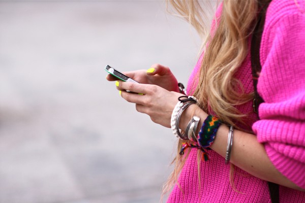
Lately I have been obsessing over brightly colored hues (of pink and mint especially seen here and here) and can't seem to get enough saturated color.  When one of my interns showed up at the studio last week with shocking pink nails (and Valentine's Day now less than 24 hours away), I thought it was the perfect time to feature "Knockout Pink" from Pantone's Nylon Brights collection.  I love how this fun shade pops against neutrals but also plays well with other brights too. There are many great ways to inject this bold color into your wardrobe, home, beauty routine or even your next event.  Here are a few ways our intern Katie suggests...

Are you brave enough to incorporate this color into your daily routine?  After all, tomorrow may be the perfect opportunity to start...

Happy Monday!
xo,
stephanie


*all images found via Pinterest

Tuesday, December 20, 2011

PANTONE PlayDate - Color of the Year - Tangerine Tango

Yes, the New Year is fast approaching and that means there's a new COLOR in town! That's right ladies and gentlemen (drum roll please) the "2012 Color of the Year" is Tangerine Tango (PANTONE 17-1463).  We are already seeing this brightly colored hue on the runways, in every day dressing, event styling and interiors alike.  I love it together with turquoise (as seen here and here), crisp white and the trend still seems to be pairing it with pink.  Whether you decide to use it as a accent or a focal point, I can't help but think you'll be anything but "happy!"

DRESSING people, parties AND places. Still, best job ever!

* Images found at Design Sponge, Domino and Pinterest

Wednesday, December 14, 2011

PANTONE PlayDate - Chartreuse Surprise

People often ask me, "Stephanie, what do you really enjoy designing most?"  I always stop and think about that and come to the same conclusion each time.  I simply enjoy the challenge--the challenge of creating something new and different--something that is specific to the style of the individual, the event and/or interior space I am creating.  I am simply inspired by my clients and the things that inspire them...so many pretty things...both vintage and modern, rustic and glam, sometimes neutral and sometimes full of saturated COLOR.  This week I can't seem to get enough bright chartreuse (PANTONE 14-0445X) and with the holidays right around the corner I feel like I am seeing this gorgeous green everywhere.  

See how fun DRESSING people, parties AND places really is?  Still, best job ever!

*1. Photography by Johny Miller 2. Vintage VOGUE, 3, 4 & 5. Sourced on Pinterest

What colors are inspiring you this holiday season?
xo, stephanie

Monday, April 9, 2012

Pantone Playdate - Pretty Pastels

One of my favorite things about this time of year is the opportunity to design with pretty pastels in mind (after all, wedding season is upon us!).  These two hues pair together perfectly...not to mention they look good enough to eat!

Images Clockwise: 1 2 3 4
Does this palette inspire you?  We hope it is a refreshing start to your week ahead!
xSB